Sanem Plastik
Representation of Creativity 'Very Peri'
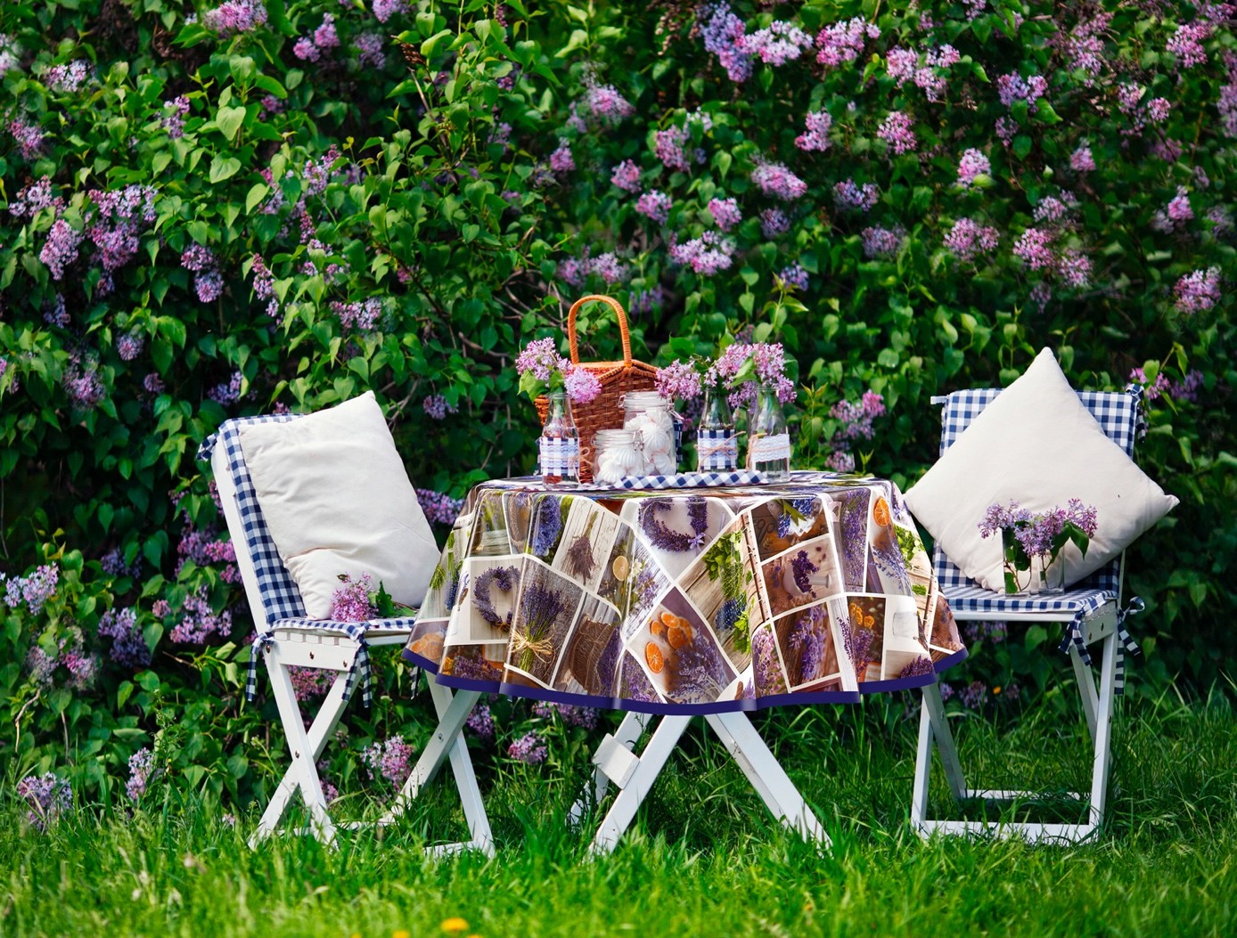
We often use this expression 'Home Sweet Home'. Because our home that witness to all our memories is one of the most special areas. The special areas are also very important for us and that's why we watch out for the decoration of our home. Especially in the last 2 years, we have once again understood the importance of our home during the quarantine period. While some of us have enjoyed our home, some of us have changed the decoration of our home. While making these changes, we closely follow the color and texture trends of that year. We create unique spaces by combining ergonomics, creativity and colors. Of course, at this point, Pantone helps us a lot. Pioneering in many sectors from clothing to interior design trends by choosing a new color every year, Pantone determines the color of the new year as a result of the evaluation of a committee composed of Psychologists, Economists, Sociologists, Designers and Institute officials who evaluate the events of the previous year while determining the color of the new year.
As like as every year, Pantone has determined the color of the year. Which color is this? Let's examine it together.
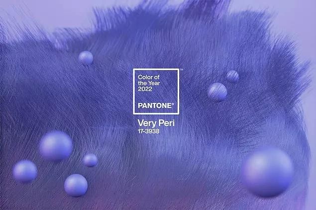
The global color authority Pantone Color Institute has announced the color of 2022. This year, instead of using colors from the existing color library, it created new shade for the first time. It combined the calmness of blue with the excitement of red while creating this new color tone and named the combination of these two contrasting emotions 'Very Peri'. “Finding a new color was really important to us. The PANTONE 17-3938 Very Fairy selection brings a new perspective and vision to the trusted and beloved blue color family. Very Peri displays a lively, cheerful demeanor and dynamic stance that encourages creativity and creative expression.” said Leatrice Eiseman, Executive Director of the Pantone Color Institute.
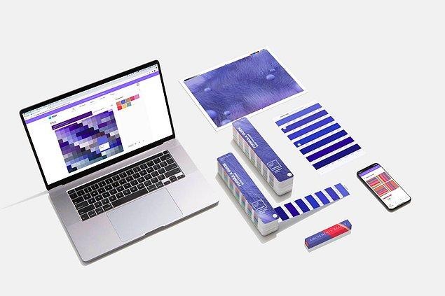
“Society continues to recognize color as a critical form of communication, a way to express and influence ideas and emotions, interact and connect. The complexity of this new red-purple-based blue shade highlights the extensive possibilities that lie ahead. Coming out of a long period of isolation, Very Peri represents the transformative times we live in, where our understanding of daily life has changed, our physical and digital lives are more intertwined.” said Laurie Pressman, vice president of the Pantone Color Institute.
Eiseman said that ‘‘Very Peri symbolizes the future. This color has lively, cheerful demeanor, carefree confidence and creative spirit we're talking about."
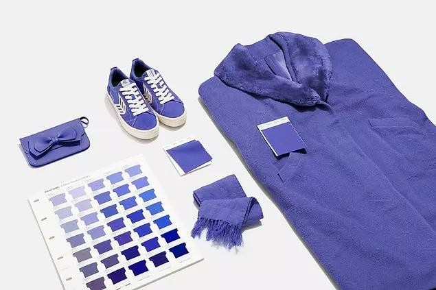
So how can we reflect this Very Peri color to our decorations?
As we know, color harmony is very important in the place. Researches have shown that the effect of color on people is quite high. For example, green evokes nature. It gives people peace and security. Representing innovation and rejuvenation, it makes people feel alive, while beige, the lightest shade of natural colors, is the color of purity and harmony. It calms the soul by giving calmness to the person. At this point, the spirit that color combinations add to the decoration can really differ. Different color combinations offer us countless options in home decoration. When we can reflect our own personal pleasure with colors, it is inevitable to say "My home, my beautiful home". At this point, when we combine the Very Peri color offered to us by Pantone with both lively-exciting colors and soft-stagnant colors in decoration, we can add a very different atmosphere to places with different color combinations of the same color.
Considering these differences, we apply color harmonies that will appeal to every soul in our color combinations in our designs.
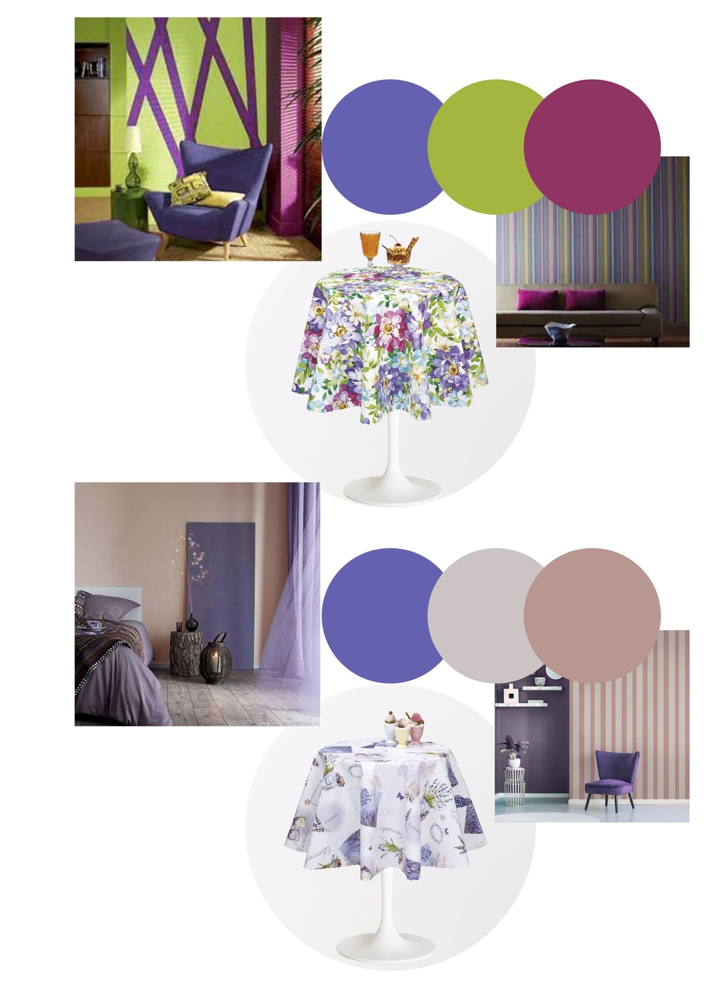
The name Pantone gave to this year's color is 'Very Peri', 'Representation of Creativity', which describes us exactly...

![]()
 CUSTOMER LOGIN

